Program Capacity Dashboard | |
|---|---|
The Form 4 Program Capacity dashboard provides information on MIECHV awardee program capacity data. The dashboard represents data in the following categories:
Visualizations in this dashboard: This dashboard includes visualizations of quarterly caseload and capacity trends. Caseload data is shown by continuing households and newly enrolled categories using stacked bar charts. Capacity percentage data is shown using a line graph, which includes a caseload capacity benchmark represented as a dashed reference line. Filters: The dashboard includes a multi select Fiscal Year & Quarter filter, and single select Activity Code filter. The organization filter will be limited to the awardee’s own organization data. Visualizations can be filtered by applying the filters which gives an ability to filter the data for different years starting from FY 2017 Quarter 4. On hovering over the charts, the corresponding values for the visualizations are shown in the tooltips. | |
Program Capacity Dashboard Visualizations | |
Current Caseload: The stacked bar chart demonstrates the number of current caseloads based on continuing households and newly enrolled categories. Note: Test data is used to represent the data in this example visualization. | |
Capacity: The line graph demonstrates capacity percentage and includes a caseload capacity percentage using a dashed reference line. Note: Test data is used to represent the data in this example visualization. | |
Place-Based Services Dashboard | |
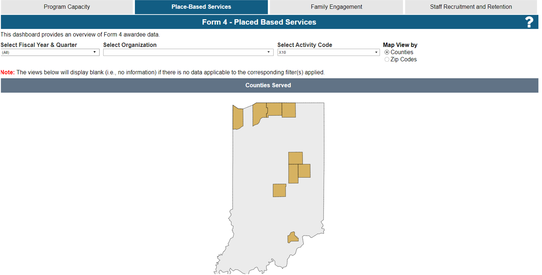
The Form 4 Place-Based Services dashboard provides information on MIECHV awardee place-based services data. The dashboard represents the data in the below Views:
Visualizations in this dashboard: The dashboard contains geographic visualizations of counties and zip codes of households served. Filters: The dashboard includes a multi select Fiscal Year & Quarter filter, and single select Activity Code filter. The organization filter will be limited to the awardee’s own organization data. Visualizations can be filtered by applying the filters which gives an ability to filter the data for different years starting from FY 2017 Quarter 4. On hovering over the charts, the corresponding values for the visualizations are shown in the tooltips. | |
Place-Based Services Visualizations | |
Counties View: The Counties Map view shows the data based on counties of households served. Note: Test data is used to represent the data in this example visualization. | |
Zip Codes View: The Zip Codes Map view shows the data based on Zip codes of households served. Note: Test data is used to represent the data in this example visualization. | |
Family Engagement Dashboard | |
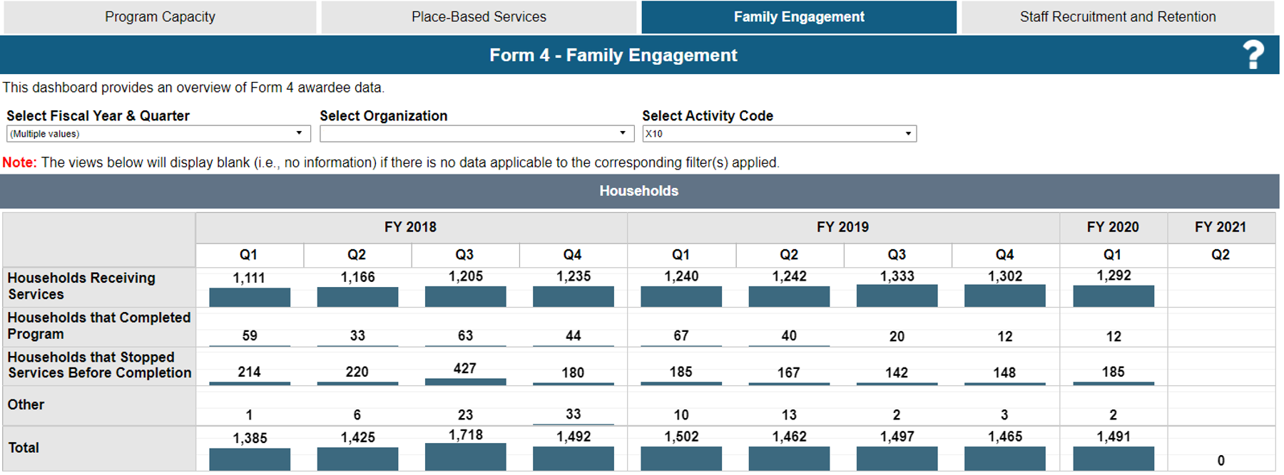
The Form 4 Family Engagement dashboard provides information on MIECHV awardee family engagement data. The dashboard represents the data in the below categories:
Visualizations in this dashboard: This dashboard includes family engagement visualizations of quarterly household and attrition trends. Household data is shown by family engagement category type using bar charts. Attrition rate (number of households who stopped services before completion/ total number of households) is shown using a line graph. Filters: The dashboard includes a multi select Fiscal Year & Quarter filter, and single select Activity Code filter. The organization filter will be limited to the awardee’s own organization data. Visualizations can be filtered by applying the filters which gives an ability to filter the data for different years starting from FY 2017 Quarter 4. On hovering over the charts, the corresponding values for the visualizations are shown in the tooltips. | |
Family Engagement Dashboard Visualizations | |
Households: The bar chart demonstrates the number of households by family engagement category type based on fiscal year and quarter. Note: Test data is used to represent the data in this example visualization. | |
Attrition Rate: The trend line chart demonstrates attrition rate trends based on fiscal year and quarter. Attrition rate calculation: (Households that stopped services before completion/Total number of households) Note: Test data is used to represent the data in this example visualization. | |
Staff Recruitment and Retention Dashboard | |
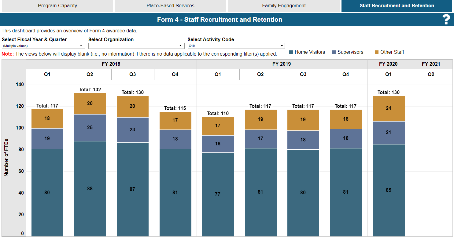
The Form 4 Staff Recruitment and Retention dashboard provides information on MIECHV awardee staff recruitment and retention data. Visualizations in this dashboard: This dashboard includes quarterly staffing trends using stacked bar charts representing values across the 3 staffing categories (Home Visitors, Supervisors, Other). Filters: The dashboard includes a multi select Fiscal Year & Quarter filter, and single select Activity Code filter. The organization filter will be limited to the awardee’s own organization data. Visualizations can be filtered by applying the filters which gives an ability to filter the data for different years starting from FY 2017 Quarter 4. On hovering over the charts, the corresponding values for the visualizations are shown in the tooltips. | |
Staff Recruitment and Retention Visualization | |
Staff Recruitment and Retention: The stacked bar chart demonstrates FTE values across the home visitors, supervisors, and other staff categories. Note: Test data is used to represent the data in this example visualization. | |
Accessing the Dashboard in the EHBs | ||
|---|---|---|
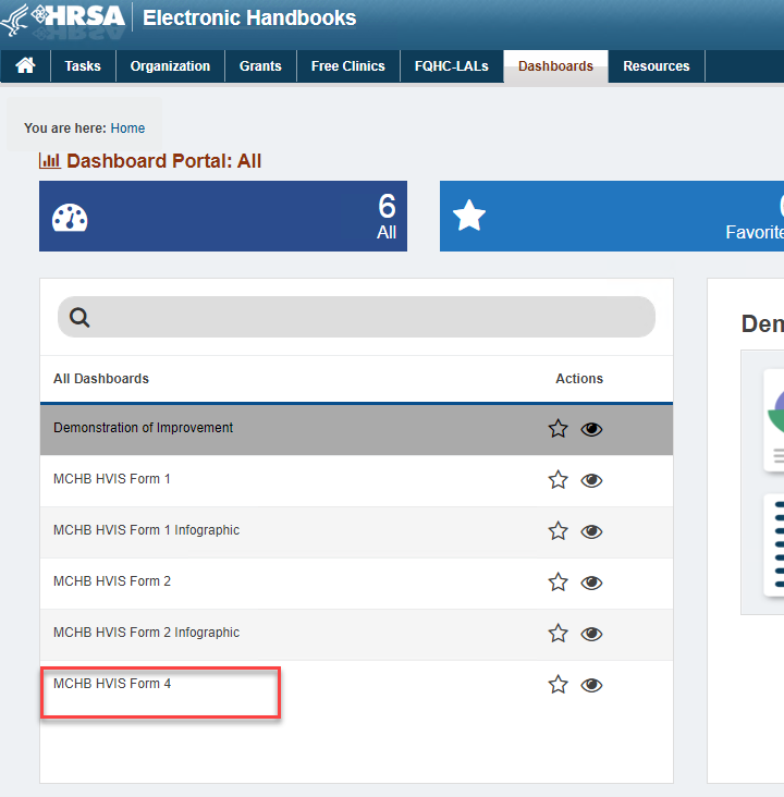
| 1 | Login to the EHBs (https://grants.hrsa.gov) using Login.gov and two-factor authentication. For information about logging into the EHBs and Login.gov, refer to the EHBs Login Process help pages. You will land on the EHBs Home page. Click Dashboards on the Top Menu. | |
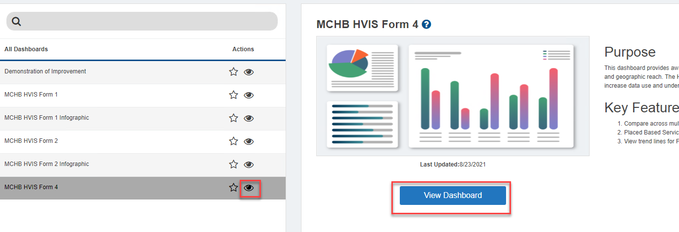
| 2 | You will land on the Dashboards list page, listing all the available dashboards. Select MCHB HVIS Form 4 Dashboard from the list page. | |
| 3 | Click on the View Dashboard or the eye icon link to open the dashboard. | |
Download |
|---|
| The tables and visuals on the dashboard can be downloaded in the following formats: image, crosstab, data, PDF, and PowerPoint. By default, when there are no views selected, the dashboard will not display the download options for data and crosstab formats. The user needs to click once on the respective visual/table that needs to be downloaded and the options to download in data and crosstab format are activated. |


